


Honing Her Craft Has A New Look!
A mood board and a meaningful rebrand

My early concepts for Honing Her Craft started on a road trip through the Southwest in summer 2020. Steve and I were living in our van for a few months before hunkering down in Flagstaff, and my freelance writing load was light. Creativity was abundant that summer with all the open space and long roads ahead, especially after isolating for so many months. I knew I wanted to start a newsletter and I knew I’d need a logo. One scorching hot day at my favorite dispersed campsite in southern Utah, I cleared the kitchenette counter and propped up my iPad. Pen in hand, I played with colors and shapes and designed three dots that have represented HHC from the very beginning.
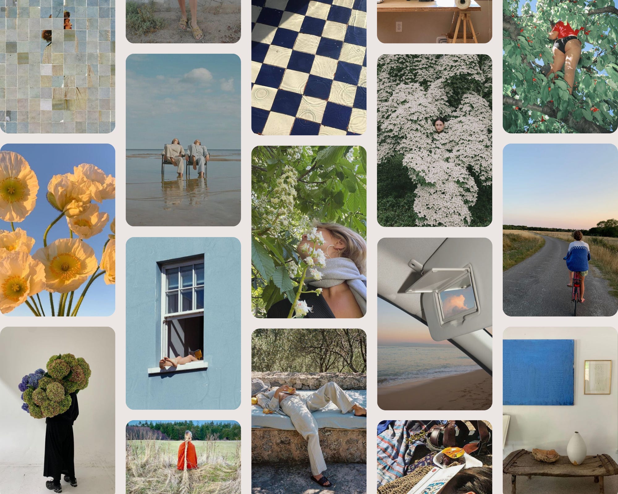
I love those blobs dearly. But as this space has evolved, those three blobs don’t feel as relevant anymore. Their colors nor their significance. I tried drawing on the iPad again, but my new vision was too specific for my clumsy hands. So I recruited an expert, my friend Alyssa Lach, to help me come up with a fresh concept that would bring Honing Her Craft into its next era. We met on a Friday a few weeks ago to re-connect, play with our creativity, and talk through ideas. Some of the concepts that came to mind were the contrast of softness + edges, ambiguous + androgynous human forms, surrealism + ephemerality, and art in nature. I provided the mood board, she provided the design chops.
I’m so excited to share the new design with you. The blob harkens back to my original design (Alyssa loves blobs, too), while the figure and flower and wavy font feels much more me. I can’t wait to turn this beautiful new design into postcards and stickers to send to all my paid subscribers ($45/year or $5/month)!
Thanks for sticking with me through all of HHC’s identities and forms.
Let me know what you think in the comments!

With love,

Love love love!! Would vouch for a sticker with this beautiful logo - I'd buy it!
Amazing!!! Love it!! So challenging to put a feeling into a look...so exciting!